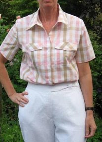
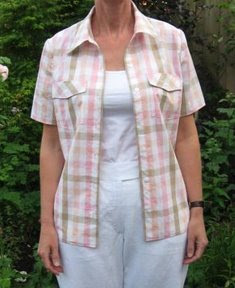
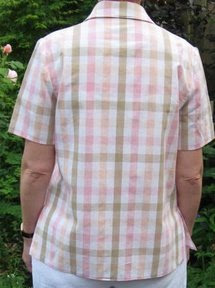
These are pictures from my finished blouse. I showed the first phase a few posts ago, and it has been finished for more than a week now, but only now I have real pictures.
 |  |
 |  |
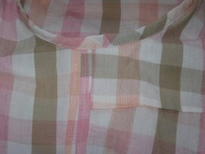
I made a size 12 with FBA and tapering to a 14/16 at the hip. And I quite learned some nice finishing, I think it was Summerset who told me about finishing an armhole with bias binding. The binding also serves as a very small sleeve head, which is nice. This is the inside:
Colors
Last Friday I had my colors analysed, and the result, to my surprise, is I belong in the winter color scheme. Lucky me, also black and white are in that color scheme, and I have quite a lot of black/white clothes. Also dark blue and teal, which are favorites are in that scheme. But the pink and tan as in my blouse above is out! Of course I won't do away clothes or fabrics just because they don't belong to the winter color scheme, and I'm still wondering if the other colors are really not good for me.
Question: how do you define your color combinations? And if you're a particular season, do you always stick to the colors of your season?
On sewing again: the pink skirt a made was not a success, and my sewing spirit has been gone the last days. Hope to have it back soon.
Parting shot, a small vase with flowers from my garden.


I'm a winter, too, and I try to stick pretty much to my colors, except for the sick addiction I have to mossy green! And I've recently begun wearing brown, but I stick to brown shades that don't have obvious red overtones. Fortunately for me, winter colors are colors I really like and naturally gravitate towards anyway. Pink is a good color for me...try different shades until you find the right one. It will be a clear pink with no yellow overtones. You can still wear other colors, just maybe not right next to your face. for what it's worth, I would wear the blouse you just made.
ReplyDeleteI'm a High-Contrast Autumn. No yellows for me! But I will still go ahead and wear a Spring palette (with lots of yellow) just because I feel like it (and because my Beloved likes those colours). The key for me is not wearing all *pale* Spring colours, but using good contrast; and bridging to my skin tone with lipstick in a bright shade of coral.
ReplyDeleteIf you find that this shirt washes you out, then fiddle with different t-shirts underneath and experiment with lipstick until it works for you.
At a recent Sewing Expo, I took a class with Cynthia Guffey, and she has a different take on colors. Her proposition was that there are high contrast people (think Elizabeth Taylor) and low contrast people (think Sissy Spacek) - based on the amount of contrast between your hair, eyes and skin tone. She argued that high contrast people should wear high contrast colors (no pastels) and low contrast people should wear low contrast colors. I haven't decided if I agree yet or not, but it's an interesting way to think about it. (She did surprise me by saying that I'm relatively high contrast...)
ReplyDeleteLovely shirt, Sigrid- it is so polished and fresh looking. I am also a winter. And I do feel best in clear strong colors like black & white, blue and red.
ReplyDeleteBut as I age, I am softening up. Now I wear many muted colors and feel good in them, too.
The most important thing for me is to stay away from yellow or tan or light pastels near my face. They are OK for bottoms, though.
Your new blouse looks very nice with the white. And white is a good color for a winter, right?
Goeden morgen,
ReplyDeleteHi I'm Ingrid and live in Australia (I have Dutch parents). I had my colours done last year and am a deep autumn with low contrast. I can't wear pure white or black near my face which is difficult as 90% of all clothing here at the moment is black or white it seems!! I found the whole experience a bit overwhelming at first until I got used to it and once I accepted it I found it much easier to shop for my colours (also helps avoid buying too much fabric, always good!). Sometimes though I admit I find sticking to my colours rather restrictive so I'm thinking of experimenting a bit. I have a couple of books on this subject and they all seem to contradict each other!
It's a lovely blouse Sigrid! And if it makes you happy, then you should wear it.
ReplyDeleteLovely shirt! At least the white is right!
ReplyDeleteI am very neutral - not warm nor cool, not high contrast and not low. A soft autumn apparently. But I wear what ever I like as long as it works for me.
How the heck do you guys know what "season" you are? I only know that I should not where yellow. It makes my indian skin look horribly sallow and green. Think puking in a boat green. Yuck. I'll have to go researching this color season business.
ReplyDeleteI really love the blouse and the back collar matching the squares on the back! Well done Sigrid!
ReplyDeleteAs to my colors, I really don't know! They come with the moment, the way I'm feeling (when I'm sad I prefer wearing bright colors to cheer me up and I love black or black and white combos when I'm happy).
The blouse is fantastic - I love a good plaid to play with and you've done this one more than justice.
ReplyDeleteI am a winter too, and tend to favor those colors. My neutrals for any season are black, white and red. The other colors are added seasonally or when they're in fashion. For summer, I bring out teals and oranges, this year I added bright yellow since it is "in", I might add a emerald green and cobalt blue this year, too. For winter I add in burgundy and dark chocolate brown. I never give up the red! I look best in brights - think 80's colors and black/white, although I don't always wear those colors.
This comment has been removed by the author.
ReplyDeleteI think this colors system is a great guideline. You will probably look your best in the suggested and contrast of the colors. Belinda had a post last year on this. sew-4-fun.blogspot.com
ReplyDeleteWhen they say to totally stay from some colors, they mean it, though! On reds, make sure yours is a blue red, not an orange red. Mine, a low contrast Spring, really needs yellow in the colors, especially in reds, beiges, and blues. People notice when I'm in the *right* colors, like yellow beige, butter yellow, orange or red-orange, and quite a few greens, periwinkle blue and a bright navy. Try your colors and see if folks notice you! I'd also love your coloring in a nice strong blue, like marine blue.
Best to you! Cherie
I hate it when I use the wrong word. It makes me cringe. "Where" should be "wear". Ugh.
ReplyDeleteThe shirt looks beautiful.
ReplyDeleteIt's hard to tell from the photographs, since the 4-season color system relies heavily on hair color as well as skin and eye tone, but I think the plaid shirt looks really good with your skin tone, even if you are a winter.
I think learning the overall system was good because it got me thinking about echoing the colors already in my skin and eyes but I also think that things can change if you're tanned, if your hair turns white, if you get sun burned -- some temporary, some not.
I like the idea of the high contrast, low contrast idea.
I've never had my colours done. I have always thought I was a winter and hated the autumn colours. Now people tell me that I am indeed an autumn. I really have no idea whatsoever what colours look good on me!
ReplyDeleteI just had my colors done as well! Turns out I'm a Spring and should wear all those bright colors I thought were too young for me. I feel better already! ;-)
ReplyDeletevtmartha